I think so too
What is the preference of others?
- Upcoming payments first
- Recent transactions first
- Don’t know / reserving judgment
- Don’t care
0
voters
I think so too
What is the preference of others?
Even better, allow both!
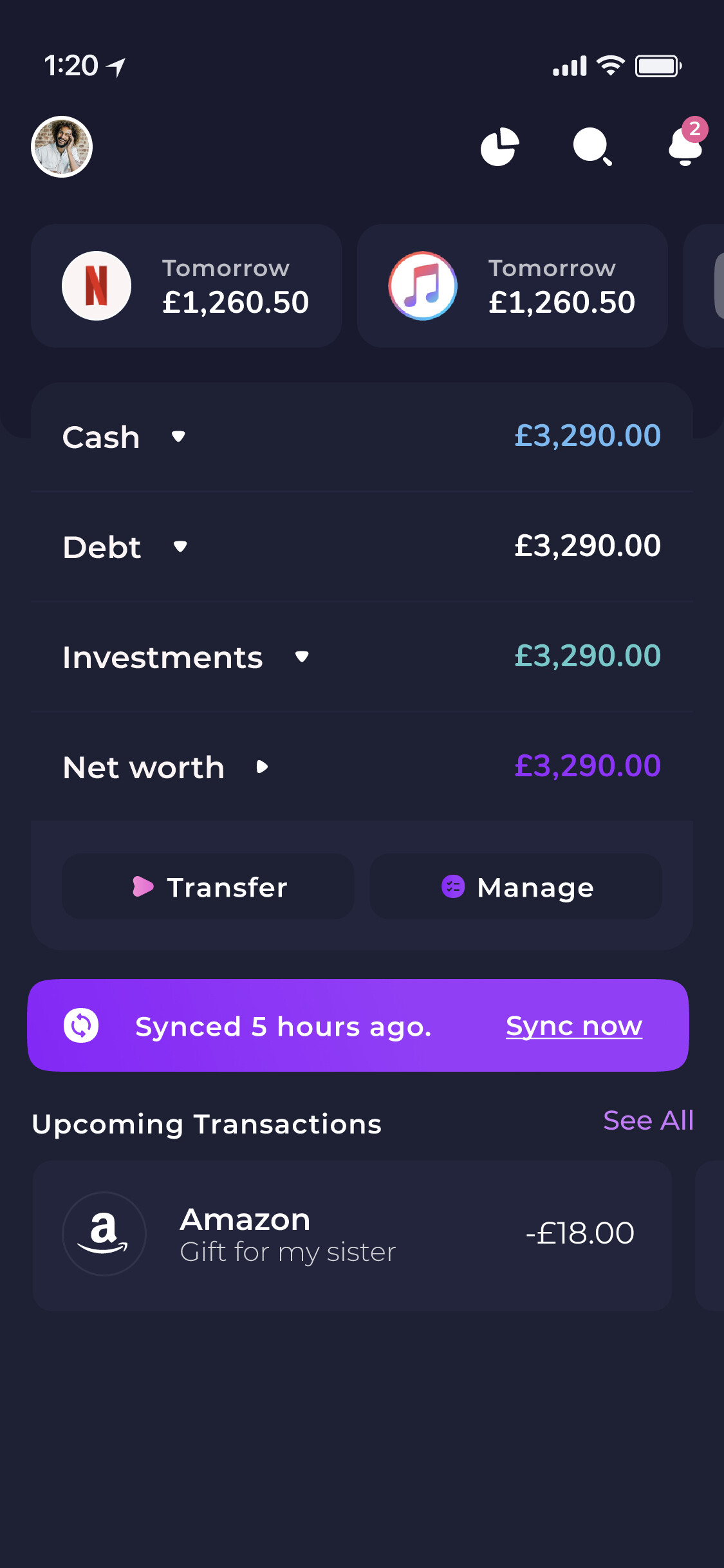
As is the case currently, if you don’t have investments or debt it won’t show here. I suspect we’ll leave the investment box there and link to how people can start investing because it’s quite an important financial step
Perhaps it would be useful to include a number which represents total value of pending transactions, perhaps as sub-numbers for cash and debt
Do you think you’d want this info in the Feed? Or under recent transactions?
The feed is what I was thinking. Perhaps incorporated in one or more of the number boxes in the screenshot shown in the opening post.
I say potentially more than one because I’m a bit unsure which box credits cards will be represented in.
Could potentially be cash or debt.
Ok cool! We’re still playing around with ideas for the Feed design so I’ll pass this idea on 
We are in the process to redesign the app, so felt the need to share this. 
Maybe just my opinion, but it really bugs me that whenever I spend on my credit card and accumulate ‘Debt’ it combines my ‘Cash’ and ‘Savings’ into one value under ‘Cash’.
It’s not useful to have money in my long term savings account mixed in with my current account. I would much rather the interface removed the Net Worth figure to make space instead for example.
Is the accounts tab/page going away?
Yes,
the idea is to move budgeting and account aggregation on the main screen, while leaving each new tab related to a specific topic.
“Track”, “Invest”, “Pay”, “Save”.
The feed is also not finished we are adding budgeting under transactions.
Will there still be a way to view transactions on a per-account basis?
How do Cash and Debts relate to Everyday and Savings/Loans?
Loving the clean look!
Same as today.
The sections expand with all the accounts.
Any chance of a screenshot of that?
Yes,
let me add it after we finish the draft.
Over the years, we have see a very big number of users opening the app and going straight into Accounts, so the whole thinking behind this draft is to move Accounts on the 1st screen.
Like this! At the moment most of the main screen is redundant for me.
Would this show % of budget spent? At the moment this is a pie chart which is only half on the screen without scrolling, when I just want to see the text total really.
Agree with this hopefully the accounts tab still has the same functionality and it’s still easy to click across between everyday/savings/investments.
Very impressed by Emma’s relentless evolution!
This is crazy good. Any ETA on when we might see this in US ?