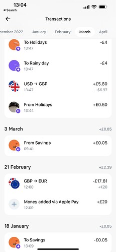
I had the idea that in the recent transaction page it would be nice to group transactions by day with a box and they have a total for that day next to the date on the right hand aide to make it easier on the eyes when scrolling
I think the issue is worse in dark mode than it is in light mode.
In light mode the font colour for the day text is different to the transaction text, making it easier to spot the boundaries between days when scrolling.
I’m not sure how I feel about boxes around days, but I think at least the light mode approach of varying font colour should brought to dark mode.
I think something just to split them up a bit more would be great maybe it is a darkmode issue. Also i do think totals for each day would be nice next to the date. Just to see like if i go out on a weekend how much have I sent on that day. Seems an easy addition
I’ve always thought the date panel should remain ‘stuck’ at the top as you scroll down, similar to how the monzo UI works.
Also still crying out for a toggle to hide/show excluded! ![]()
I’d never noticed that. But you’re right, that is quite a nice approach.
I really want to do it like Revolut.
I havent seen theirs can someone post an example
That’s exactly what I was envisioning as well, Id love for the feed to look exactly like that😂
Hopefully you’ll be seeing an interface like that in Emma soon! ![]()

