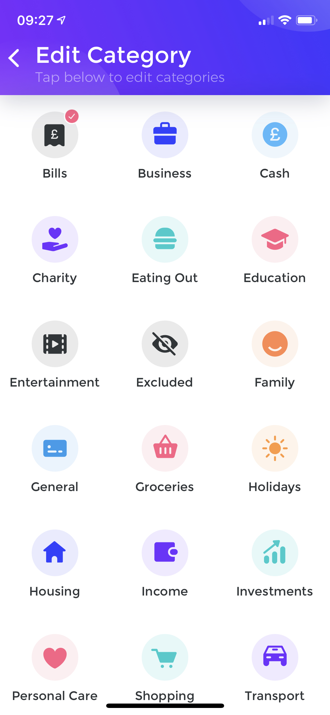
There is one thing that bothers me on the transaction edit category screen. It is a vertical scroll and inability to see all categories at the same time.
For comparison, Yolt is showing all categories without scrolls (on iphone X I should say) and I feel that space is used more rationally. Sure, they don’t have custom categories and overall automatic categorisation is much worse.
I know there are different OS’s and screen resolutions. There is also an ability to create custom categories, so the list might be very long. But there is always room for UX improvements.
How about implementing a pro feature to reorganise category icons similarly to iPhone springboard and allow horizontal pagination as opposite to vertical scroll? There will also be no need to separate custom categories from default ones. To me personally this might be the most valuable feature of a pro version (alongside existing custom categories)
We have changed this fairly recently. When we launched we were using a random order.
I think @Gaoler suggestion might be good, but really tough to communicate and it means that the order can vary every time. This might lead to a bit more friction.
This is one thing I noticed moving from an iPhone 6s to an XR. I thought I’d be able to see much more on screen (due to the larger screen). Instead, everything is just scaled bigger.
It feels like a lot of wasted space. It would be great to see more categories. The same applies to other screens as well. The circle in the analytics screen takes up almost half the screen, each of the cards on the main screen feels like it could be more compact.
Generally would prefer less scrolling if possible.