Some further improvement/issues for the landing page. Next up will be webapp.
Better QA
It’s essential to have proper QA on your website and landing pages. This is the face of your product - the first impression users get before they even download your app.
If a user tries to upgrade to a Pro plan and the button doesn’t work, that’s a critical failure. It means they literally can’t give you money. This is especially damaging for a financial services product, where trust and functionality are non-negotiable.
CTA NOT working - this is CRITIAL for conversion
Other pages work, this does not - click “Get started”, nothing happen
URL: Emma Plus | Unlock More Features with Emma Budget App
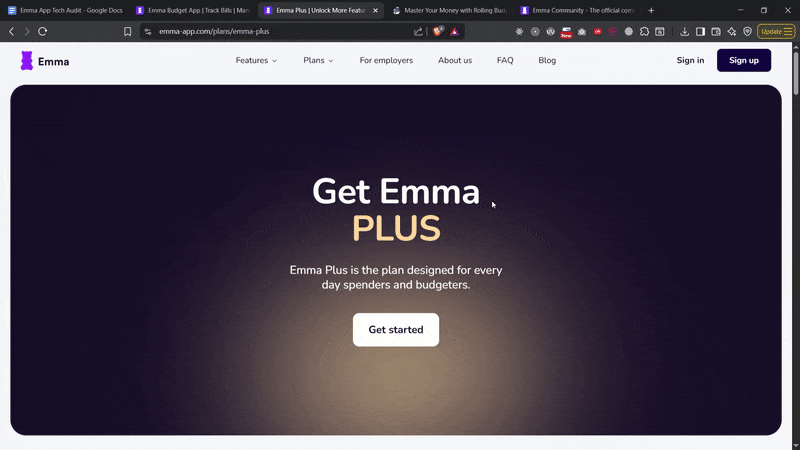
Click click click - nothing. Other pages work just fine.
Bad QA is costing you conversion rates.
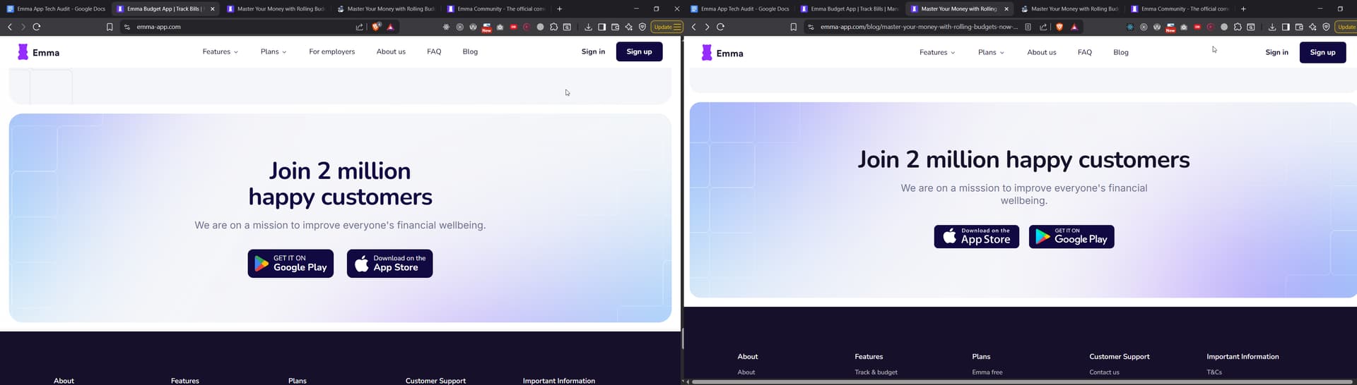
Footer CTA Hero
First of all, the “component” is not consistent across the website. It has the buttons fliped on the blog, and when you click to download Android you get Apple. As a side note, its always better to open this in a new tab so people always have Emma’s landing page open.
The issue:
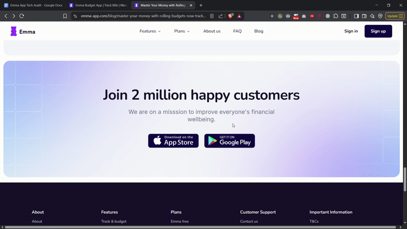
This is inconsistent branding.
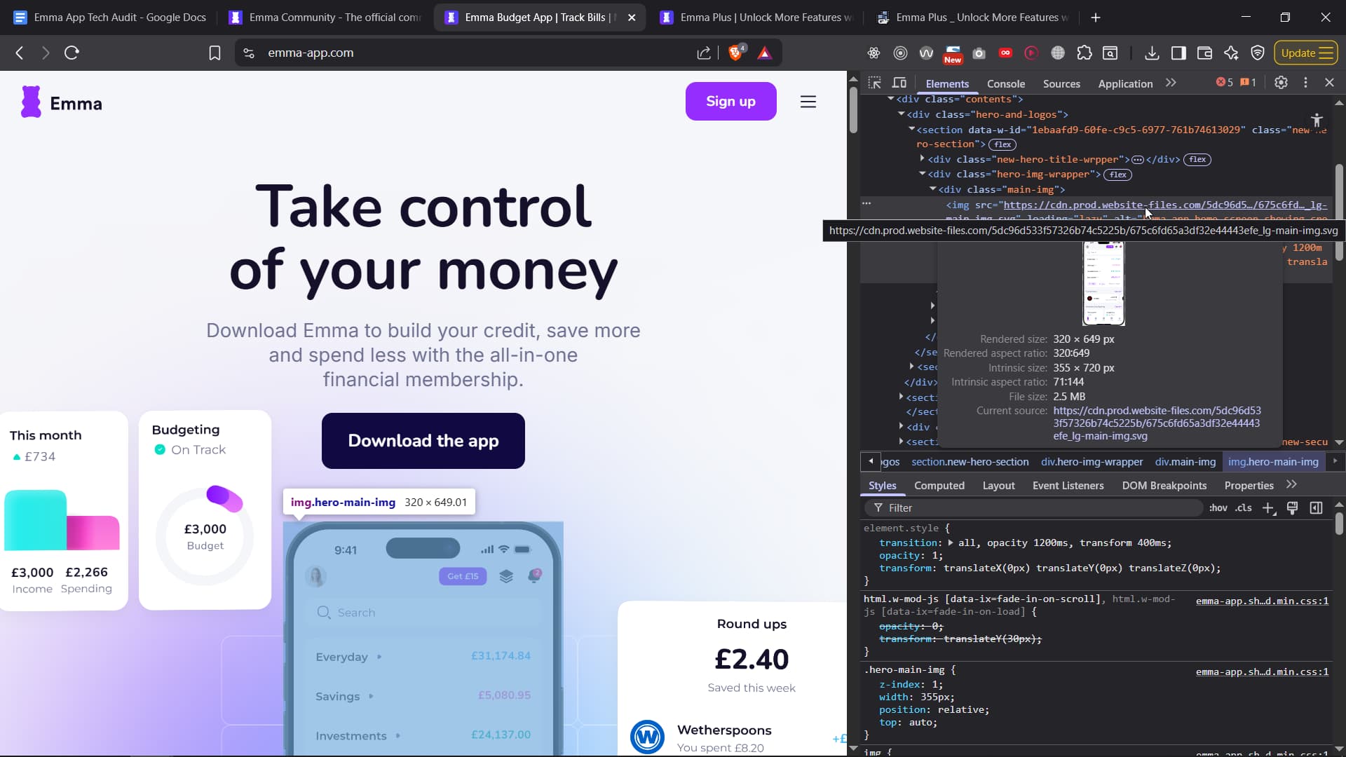
Home Page HERO section
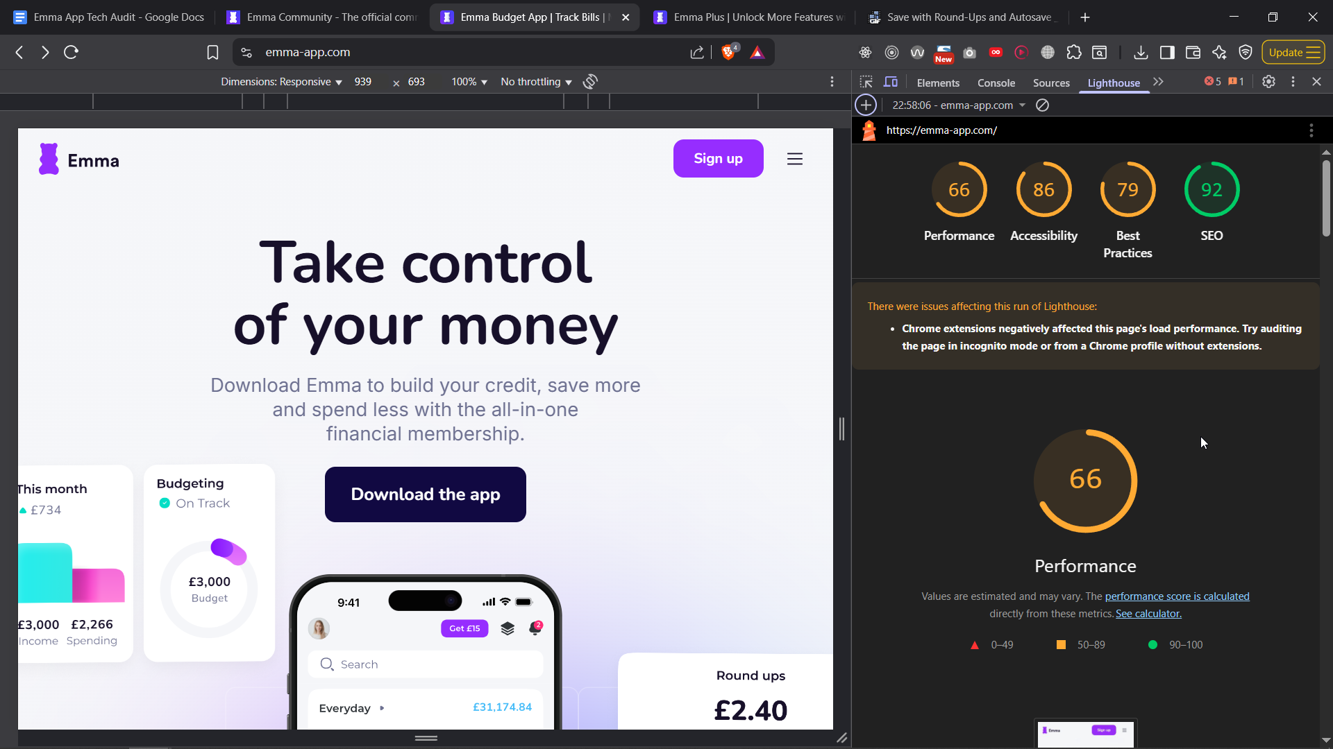
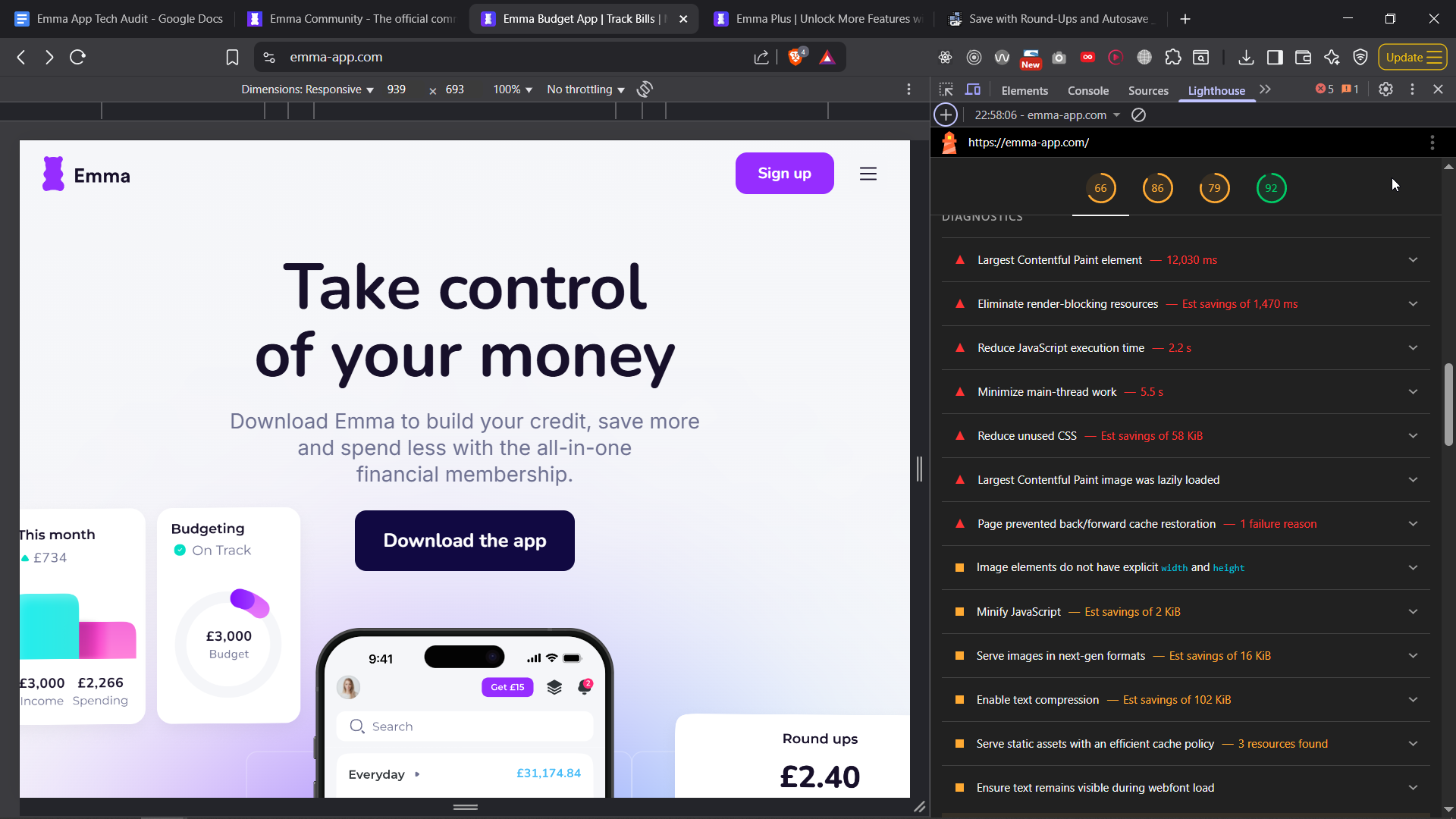
The hero image is 2.5MB - that’s 10x larger than it should be. No image on a landing page should be that heavy. On top of that, it’s an SVG, which makes no sense in this context. SVGs are great for icons, logos, and simple graphics, but not for full illustrations or photos - a modern format like WebP or AVIF would be far more efficient here.
All images are also lazy-loaded, including ones above the fold, which actually slows the page down rather than speeding it up. Lazy loading should never be used on content that’s immediately visible.
Other images are way too large for their displayed size and clearly haven’t been resized or compressed properly. The landing page is scoring around 30/100 in performance - mainly due to these issues. With basic image optimization and smarter loading strategy, this could easily be 90+.
And you know what they say about sites that load slow? Each second costs convertion rates. If google could increase their loading speed by 1second, they would literally make a few more billions.
How much would you make if you speed your site up? Easy fix.
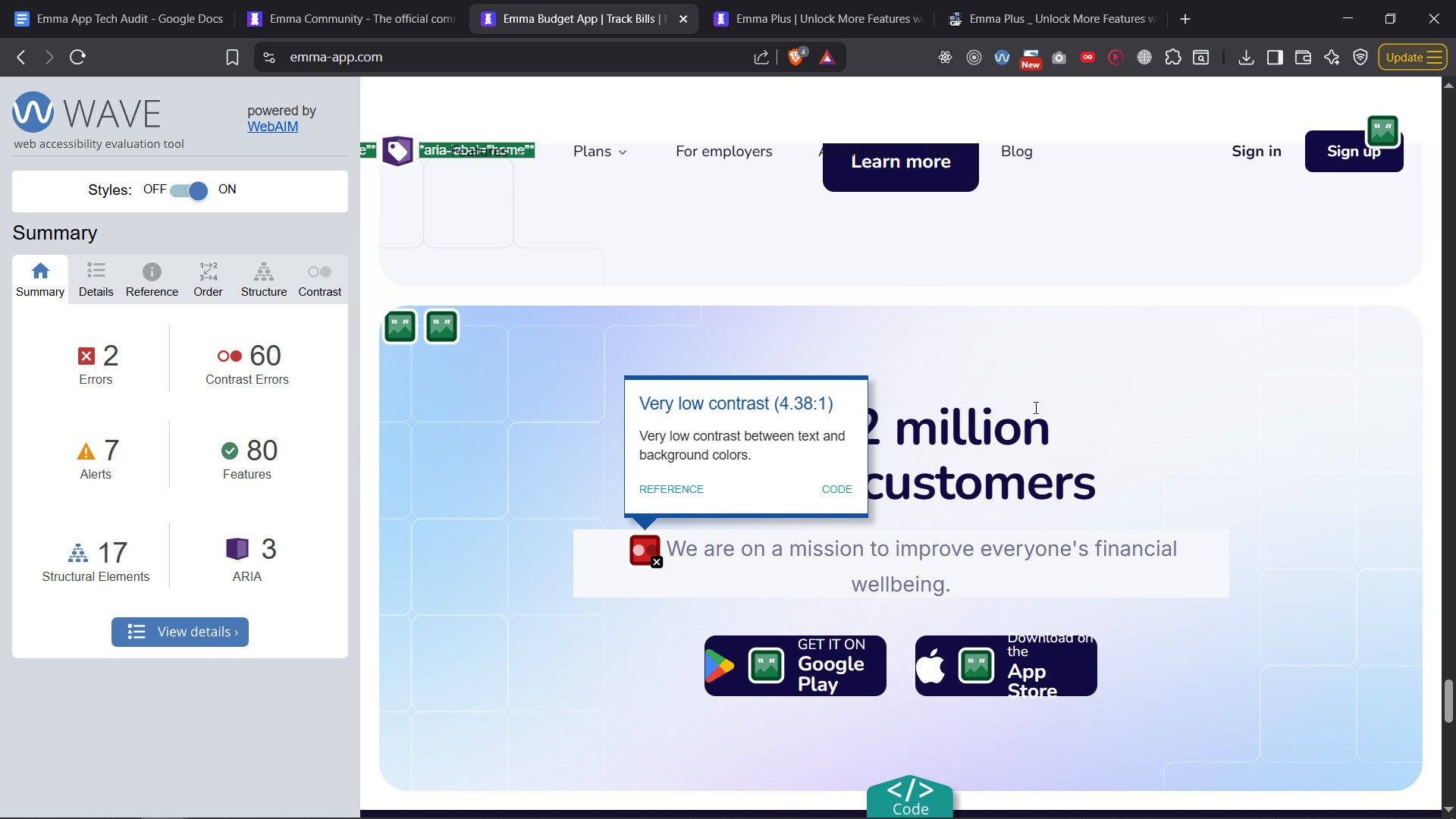
Accessability
You’ve got color contrast issues all over your w,ebsite and this definitely needs fixing by your designer to meet WCAG accessibility standards. These aren’t just recommendations - they’re part of the Equality Act 2010, which is UK LAW requiring digital products to be accessible to everyone, including people with disabilities.
Here’s the thing: there are specific groups and legal firms that team up with disabled people to spot websites or apps that don’t follow accessibility rules. They then bring legal claims against those companies, often leading to settlements or payouts - basically, companies end up having to “make it rain” money to avoid costly court battles.
Since you’re a tech company based in London, with millions in funding, you’re exactly the kind of target these claims focus on. Lots of UK companies have already faced lawsuits for similar accessibility failures. Ignoring these issues could cost you not just money, but also damage your reputation and business opportunities.
So it’s crucial to start fixing these problems now, not only to stay on the right side of the law but also to avoid legal headaches and make your product usable for everyone. Its easy to fix this.
If it was just a small issue here or there, that might be okay, but right now, you’re not even meeting basic accessibility laws. One day luck will end. You need to start thinking about building a solid tech and design base.
Tabbing
When I tab, the menu doesn’t open, there is no outline for the navigation - another accessability issue. Not going to go over them all.
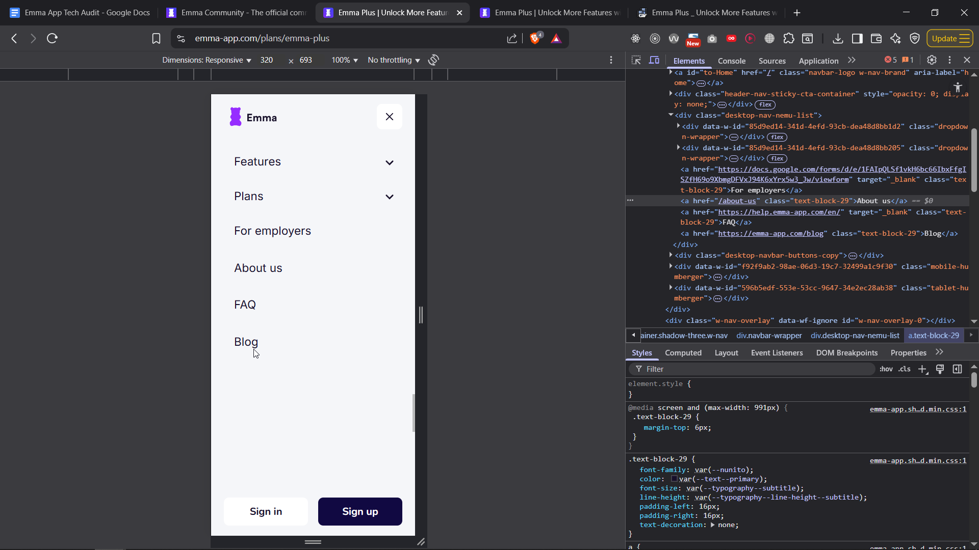
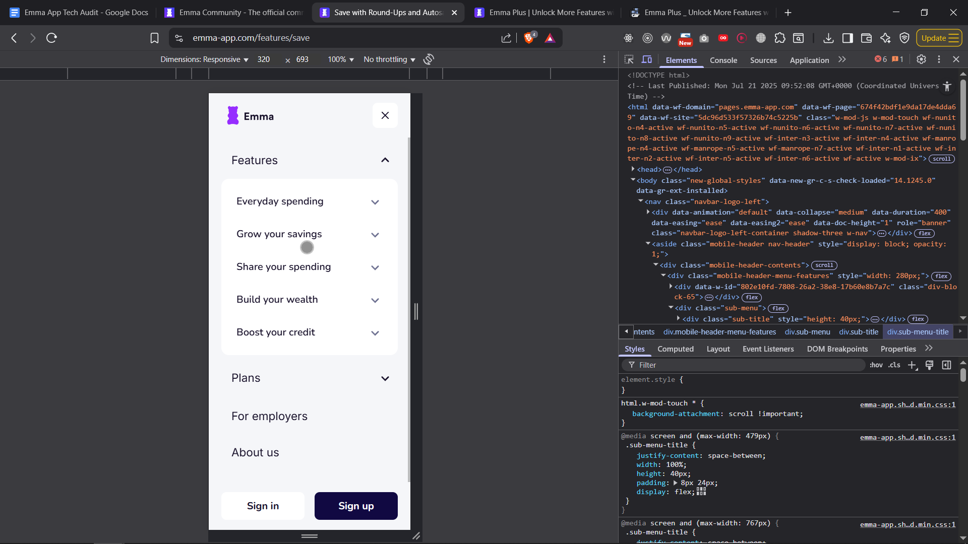
Mobile Menu
Menu scrolls when menu open
Small issue, when the mobile menu is open, the user can still scroll, which means when they close the menu they will be in a diffferent place compared to when they left.
Can’t click nav links at times
You also have issue of not having a 100% success rate on going through the link, you can see where the dot is, I click and menu doesn’t open, again, more clicks = worse convertoin rate. The menu is inconsistent
Odd Animation
When I cllick to close or open the menu, the button fades but the menu doesn’t, it gives a bad UX and its not quite a Tier One UX you’d expect from a company like yours.
General Issues - note this data might vary on device, location etc… except thngs like accessability and SEO.
Here’s from google page speed insight:
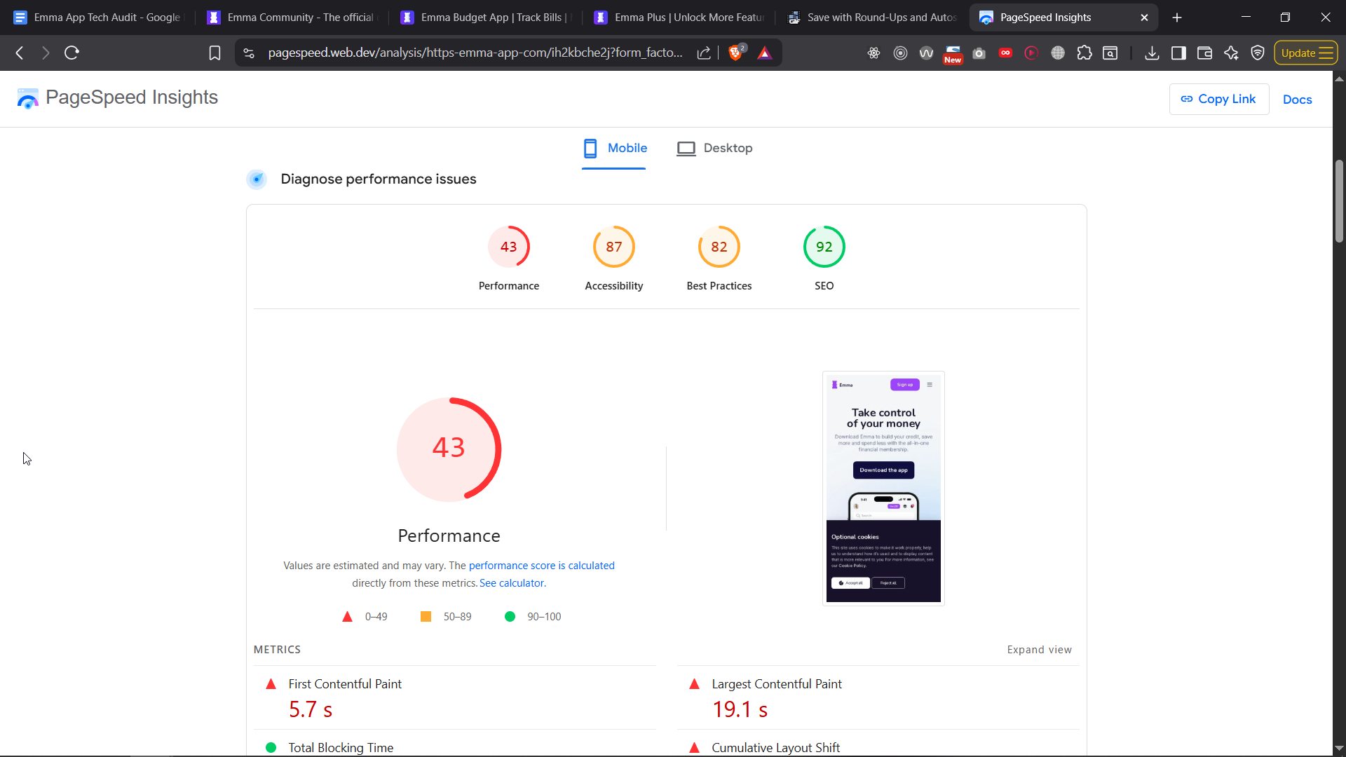
Might not be a big issue however, and these metrics can be vanity metrics, I woudln’t stress over these metrics too much, but still they are an indicator of potential issues - however, again a 2.5M image, and more images will add up to quite a lot - so you can deffo improve the speed by some second or whatever.
Logged in user shows a “sign up” button
I’m already logged in, but I still have the button to log in.
Needing mobile app to sign to web
This might be due to compilance, I don’t know, but would be nice to have email/password as sign up option, instead of QR code. What if mobile is down? Or away from me? But again, could be due to compilance so I could understand.
Unecessary Horizontal Scrollbar
This should not be there, makes the site feel broken, again this is a bug so needs a fix.
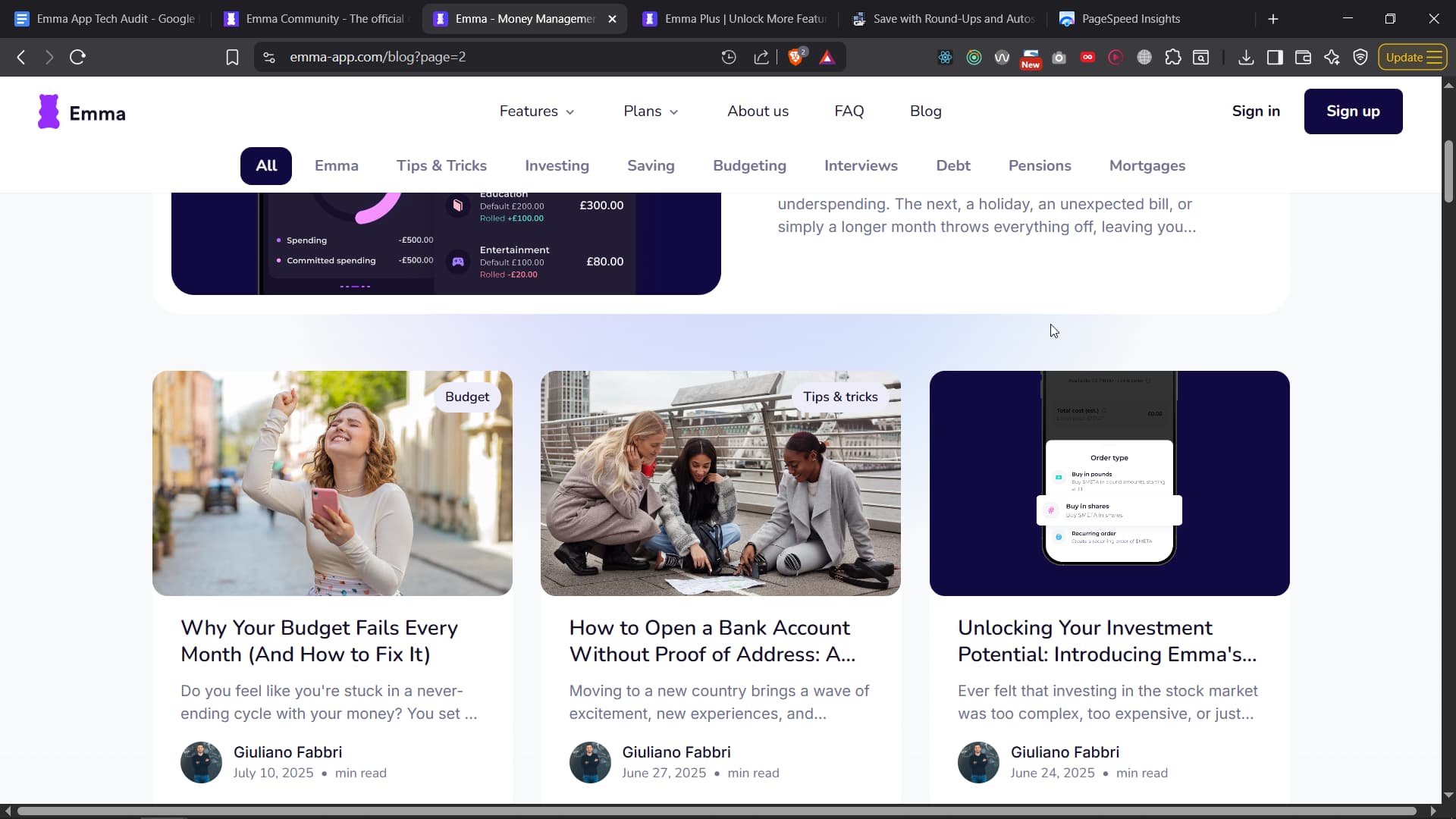
UX issue for blog with tabs
If you’re on mobile, how would you know there are more categories to look? Consider adding arrows left/right - common solution for this. Again, this is a UI/UX thingy.
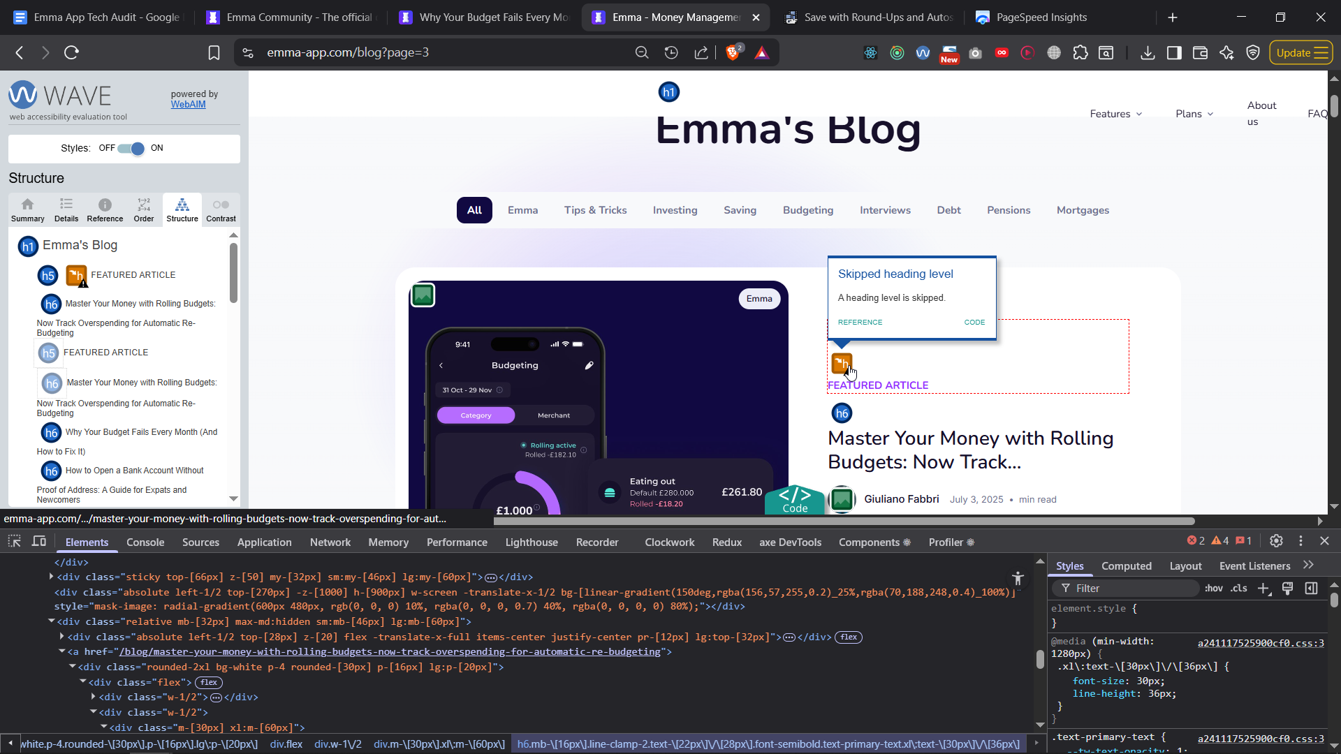
Bad SEO TAGS
This is really bad! Why is this a h6? To get SEO working properly you need a h1 for the title!

Why is recommendation “You might also like” a h1? That makes every single page of your URL take that h1 as the title, screwing over your SEO AND accessability guideliens.

You also have the same issue on the blog page:
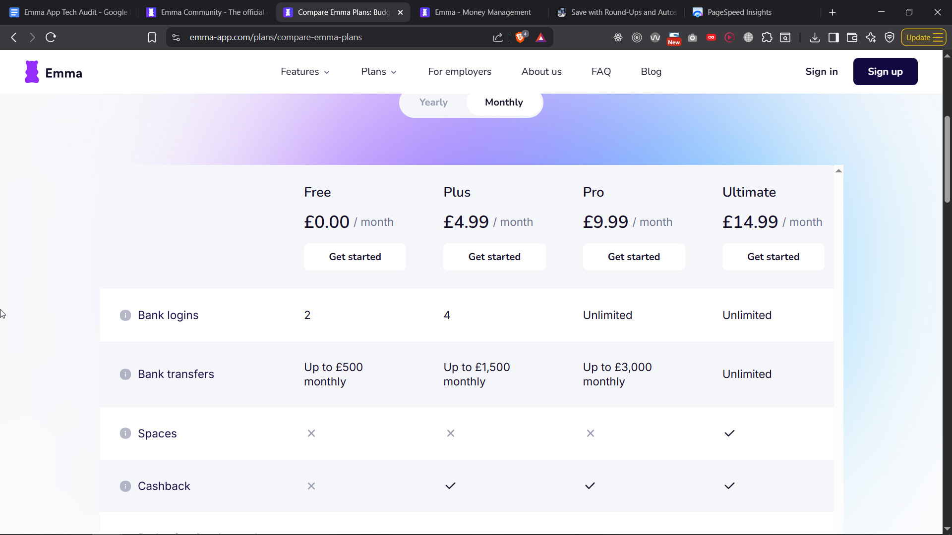
Better Pricing Model
If you’re having such a long list, consider having the headers stick at the top as user scrolls so they don’t have to scroll back - this table also needs some design love. It also has scrollbar that is not that.
On mobile this is horrible. Consider copying font-awesome way of doing it with a twist:
So far this is impossible to compare on your mobile
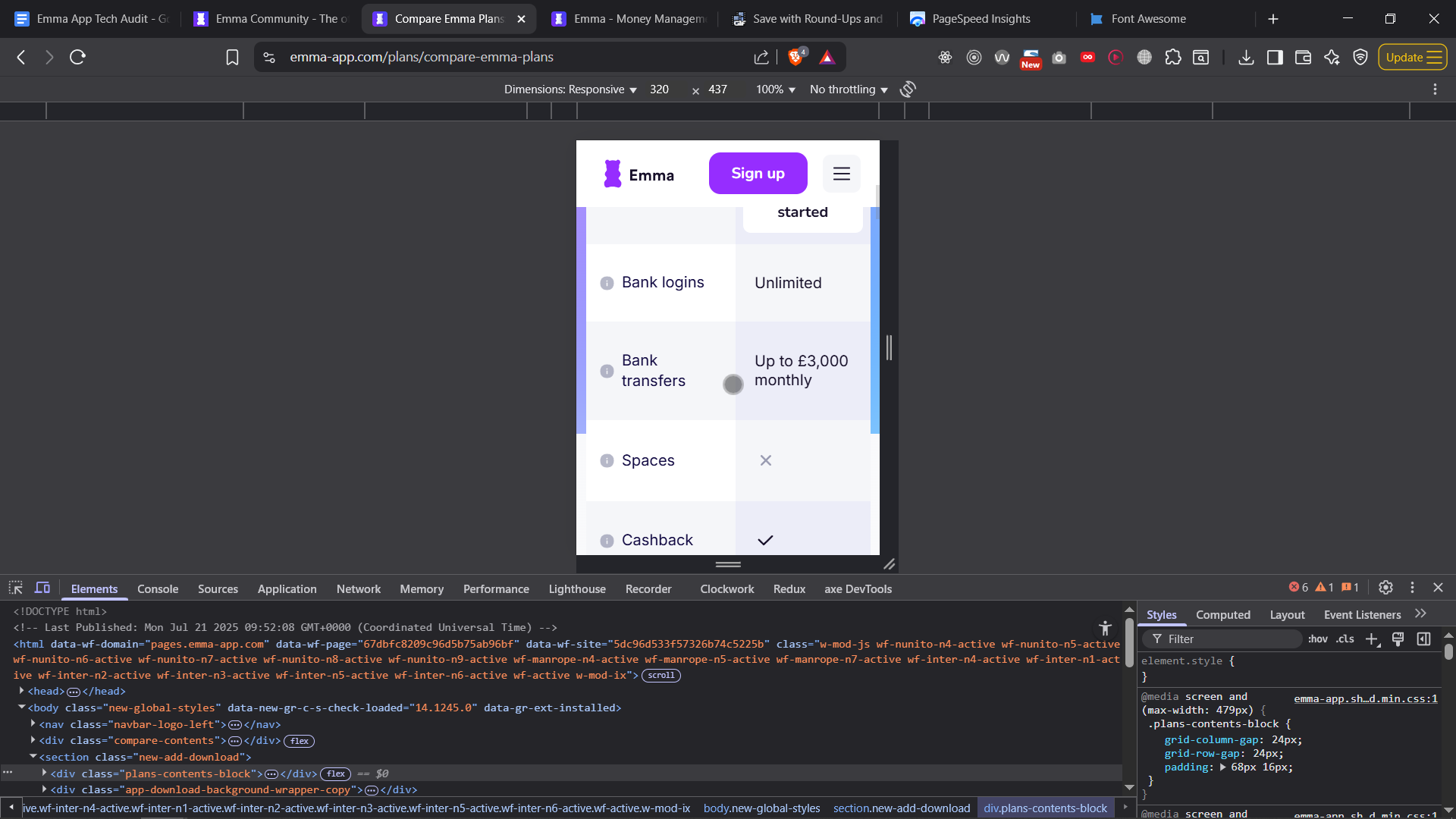
If you fix the UX for that, you are guaranteed to increase conversion rates. Its just too hard to use there as you can see from the screenshot.
And another bug, “Get started” hides too quickly, consider hiding it when the other button comes to the screen - easy fix.
Coding Standards
I’ll keep it quick but the current code uses TailwindCSS, but its written in a way that doesn’t look maintanable and mixes some techniques that shoudln’t be mixed.
Beside the wrong use of HTML tags here and there, which affects your SEO and accessability, you also have odd techniques used like adding a “br” tag instead of a space, and then unifying this with a good max-width style…
Idealy you want a desing system as well, but that is a toatlly different advanced topic.
Better CTA for hero
I’d re-condier the copy for the hero as well.
I would add
MY CTA (bare in mind I spent only 5minutes on this)
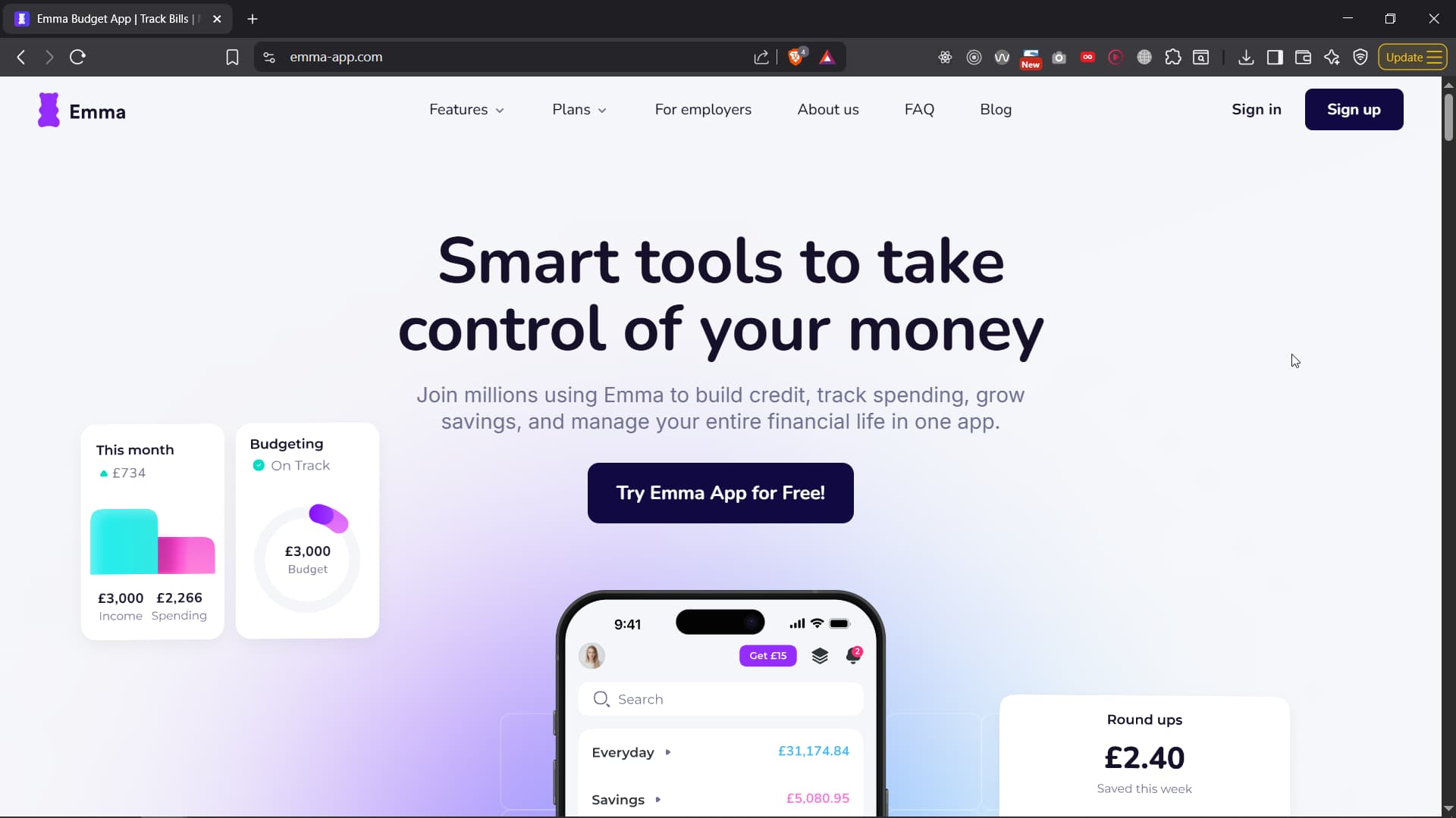
Header: Smart tools to take control of your money
Description: Join millions using Emma to build credit, track spending, grow savings, and manage your entire financial life in one app.
CTA Button: Try Emma App for Free! - which is more inviting and less boring than “download the app”
- Clear value: “Smart tools” communicates how users gain control — not just a vague promise.
- Concrete benefits: Lists specific actions (build credit, track spending, grow savings) users care about. - which you’ve done similar
- Social proof: “Join millions” builds trust and credibility instantly.
- All-in-one positioning: “Manage every part of your financial life” reinforces Emma’s full-solution value.
Compared to what you got now
Header: Take control of your money
Description: Download Emma to build your credit, save more and spend less with the all-in-one financial membership.
CTA Button: Download the app
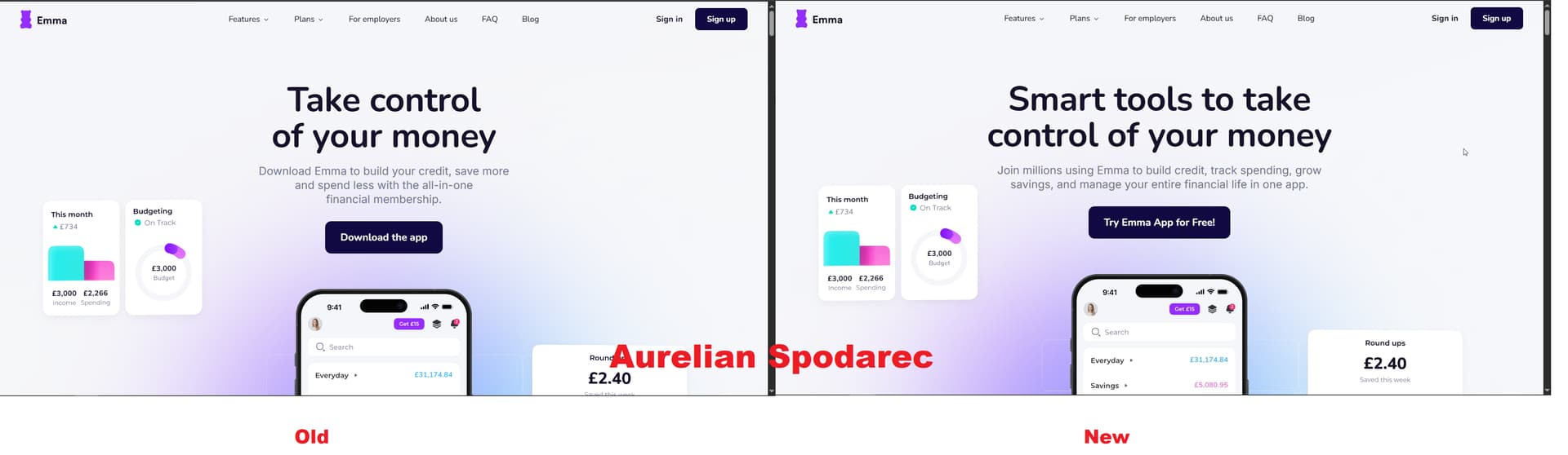
You should A/B test this.
For the next 100,000 visitors, half of them showthem my copy, and the other half your original copy - see what converts better.
Bigger picture
Hiring interns for critical systems (like your API or landing page - I just read your other post) is risky. Interns don’t build foundations - they learn on top of one. The mistakes can cost more than its worth it. Check your analytics on how much convertion you lost on your “Plus” plan, fix that now, and lets see how much more convertoin rates you’ll get the next month or two - I’d be curious myself; if you suddenly start seeing signups from your webapp “Plus” plan - how much money did a random person on the internet (me) make you in the future? Hehe.
The value of proper architecture, QA, and experienced devs pays back in speed, stability, and customer trust. Right now, many of these issues stem from process gaps: lack of QA, inconsistent standards, no dedicated conversion optimization, and code written without a senior technical foundation.
Quick wins to prioritize:
- Fix the broken “Get Started” CTA
- Fix the Plus button
- Fix the CTA on Blog so when you click “Download Android” it doesn’t bring you to Apple
- Compress and reformat hero images
- Resolve key accessibility failures
- Improve mobile navigation behavior
- Audit and refactor key HTML/SEO structures