My thoughts exactly.
This would be my preferred implementation too!
My thoughts exactly.
This would be my preferred implementation too!
We can think about this.
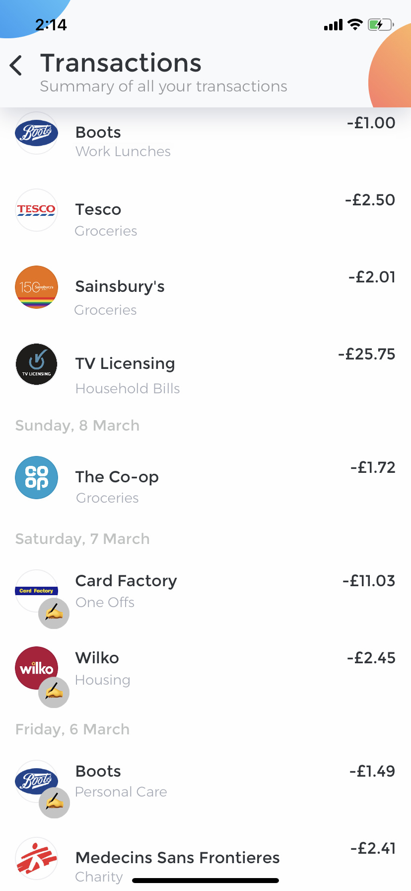
What we are noticing from these first few days is that Category Edits have increased, so this feature will definitely stay.
We are going to test a different position to see which one performs better and then will decide.
Our ultimate goal is to allow people to make more edits. 
I’m certainly no designer but I will give it a shot and see if I can move things around. Once I’ve got a few iterations I’ll upload to get your thoughts.
Support is busier than usual so I might get to it around Thursday/Friday
The first results are telling us people edit categories more, so we are actually making this a default. Starting from today.
It’s not as visible as the current one. ![]()
Yeah I prefer those to the current one.
For the first alternative I suspect the note icon could be more subtle.
For the second alternative I suspect it would be better to have the category above the note when a note exists. Perhaps also better if there is some contrast between the category and note text.
My opinion: I like the current version in the app where I can see both notes and categories without tapping the transaction.
First alternative: This breaks the flow of managing transactions by adding more taps (going into single transaction each time)
Second alternative: Design inconsistency between transactions with and without notes
For the second alternative, as @o99 suggested category above note (as note is optional) might look good and maybe differentiate both with a visual cue such as color, font etc.,
@o99 If I get some more breathing space next week I’ll make a few more changes although I think the boss has spoken on this