Hi Team,
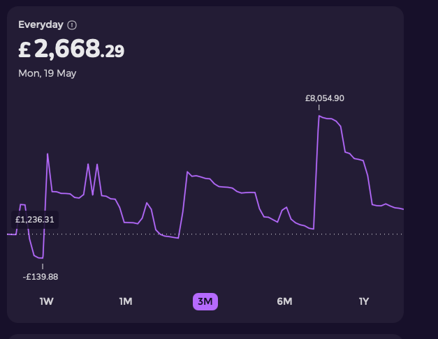
If you look at the graph below it’s pretty obvious what I’m referring to I hope 
The large account transfers are down as excluded but still show on the graph and it skews the data.
Please could we also get a trend line on the graphs so I can see my monthly balance going up month on month? Because sometimes it’s not clear as you may start the month with more money than the previous but then spend more that month
2 Likes
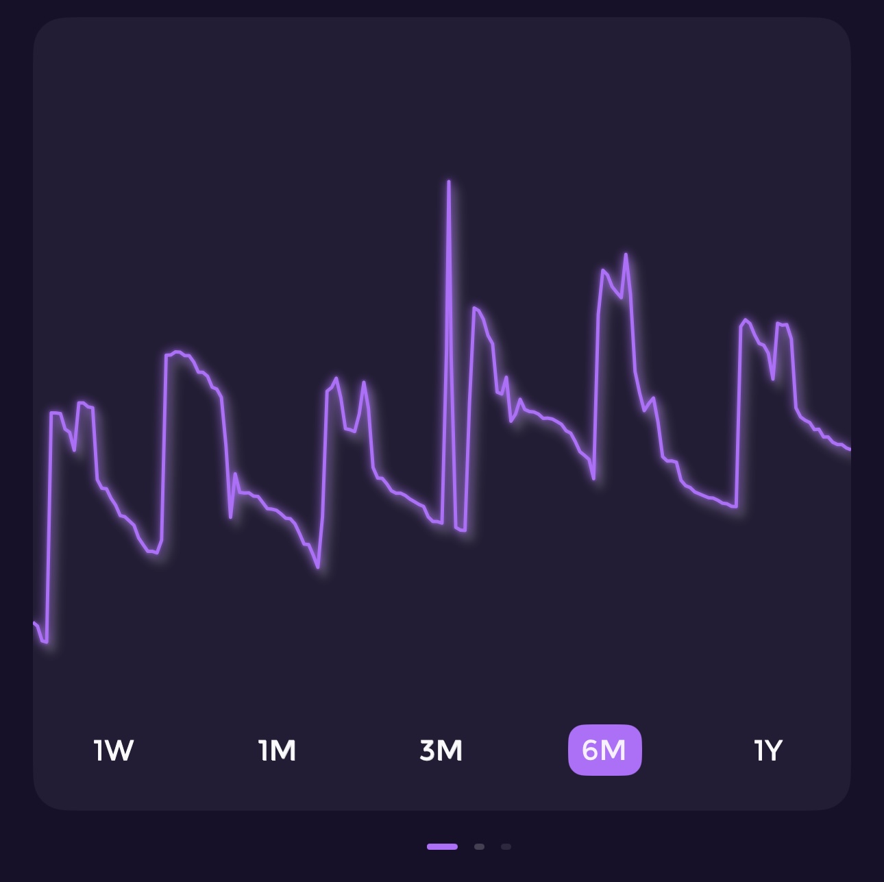
I don’t find these graphs useful at all. There are no axis information or anything.
Can you let me know what improvements you want to see?
Hey @Nathan.f,
we have worked on a few updates that will come out in the next few days, but the graphs in Feed will start looking like this:
1 Like
Hi, are we now able to exclude transactions/transfers from the graph?
From offline transactions, you can just delete them; this was fixed a few months back. 
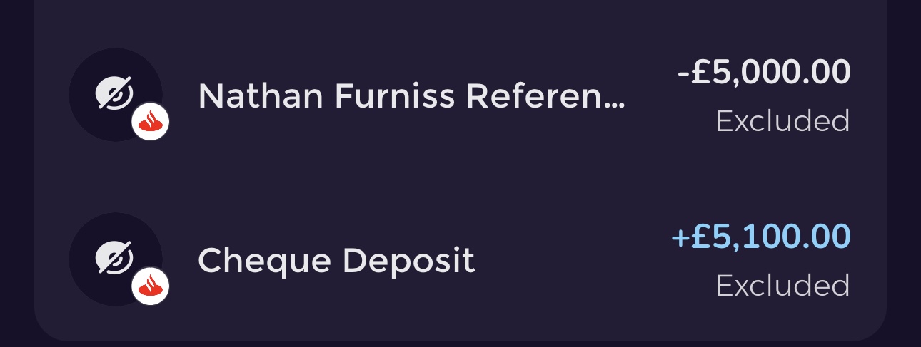
Hi mate, it’s this, even thought they’re excluded they are still on the graph
Hi @Nathan.f,
the graph tracks the balance change, not the spend over time; it makes sense to include the excluded, no?
Hi yes, I want to remove the very large balance change from the graph, the money went in and then went out because it was just a transfer but now I have the massive skew on the graph. I have put them as excluded but they still show up on the balance change graph
Hi @Nathan.f,
yes, as of today, this is still expected behaviour; we are revisit this.